Mobile App Redesign, Consumer Wellness
Ember Collective
Turning class scheduling into a ritual
Product Design · UX/UI Design · User Research · Mobile App Design
Project Overview
Ember Collective is a holistic wellness brand offering heated fitness classes and strength-based training designed to support mental, hormonal and physical health. The mobile app is the core digital touchpoint for members: where they book sessions, track progress and stay motivated.
The goal was not simply to make booking easier. It was to build something that actually feels good to use. Redesigning the app from the ground up turned class scheduling from a transaction into a ritual, one that celebrates progress and consistency.
The Challenge
Members were struggling to book sessions efficiently. Feedback showed that people:
- Found the original booking flow confusing and repetitive
- Could not see class focus areas or calorie detail before committing
- Felt no sense of progress or reward for showing up consistently
The experience felt transactional rather than personal. It was missing the motivational quality that defines the brand everywhere else.
Discovery
Research came before any screens were drawn:
- Interviewed members to surface booking and motivation pain points
- Mapped user journeys to find friction in navigation and scheduling
- Audited competitor apps for usability and engagement patterns
- Confirmed that members wanted simplicity, clarity and a more uplifting experience
A Booking Flow Worth Repeating
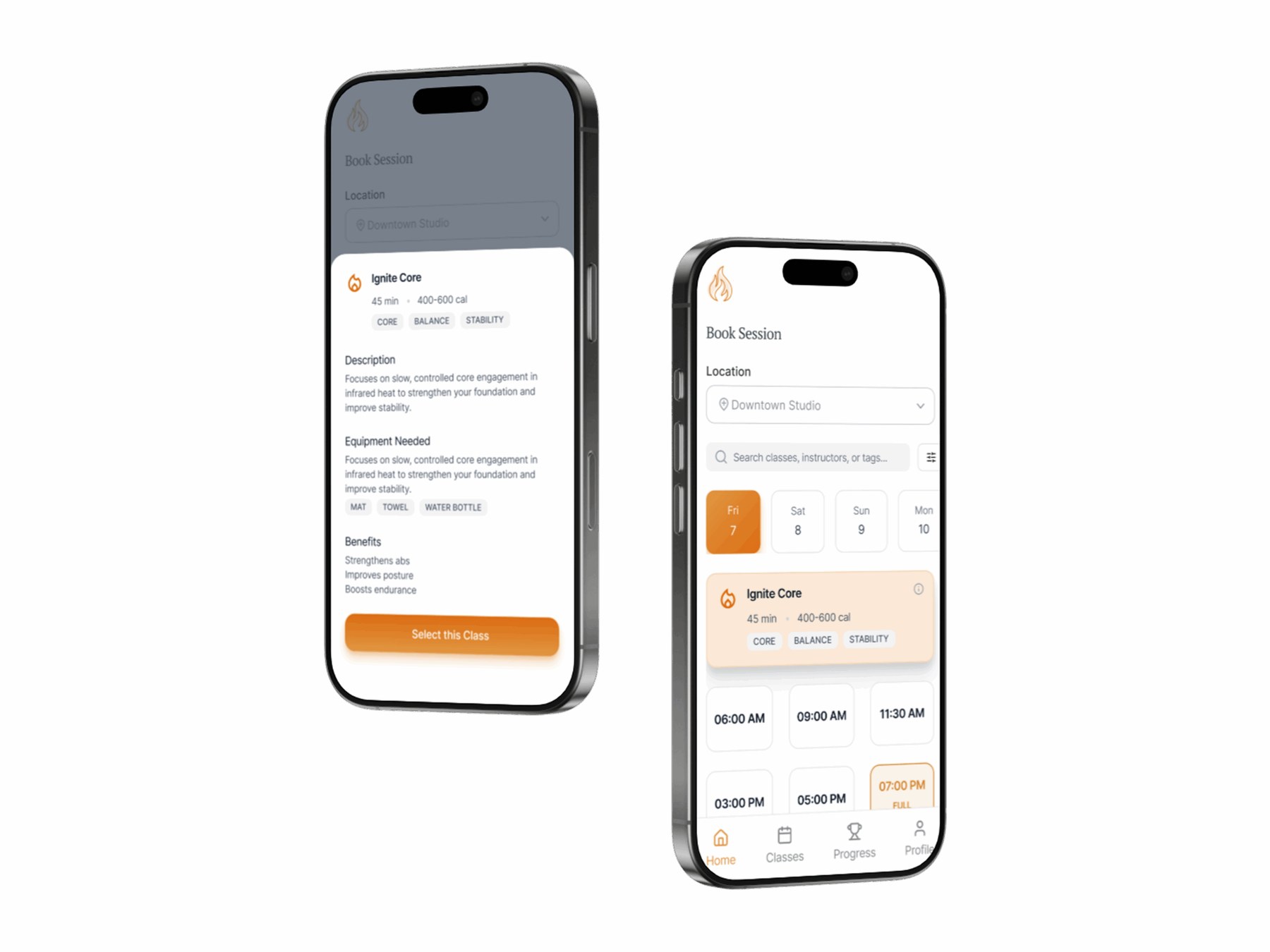
Booking was rebuilt around how members actually decide. A simple date selector opens onto that day's classes, tag-based filtering narrows by Core, Strength, Flexibility or Balance, and a class is confirmed in three taps.
Every class carries enough detail to choose confidently before booking: duration, calorie range, focus areas, difficulty, benefits and the equipment required. Hot and Weighted programs each get their own icons and accent colours, so the difference registers at a glance rather than after reading.
Making Progress Visible
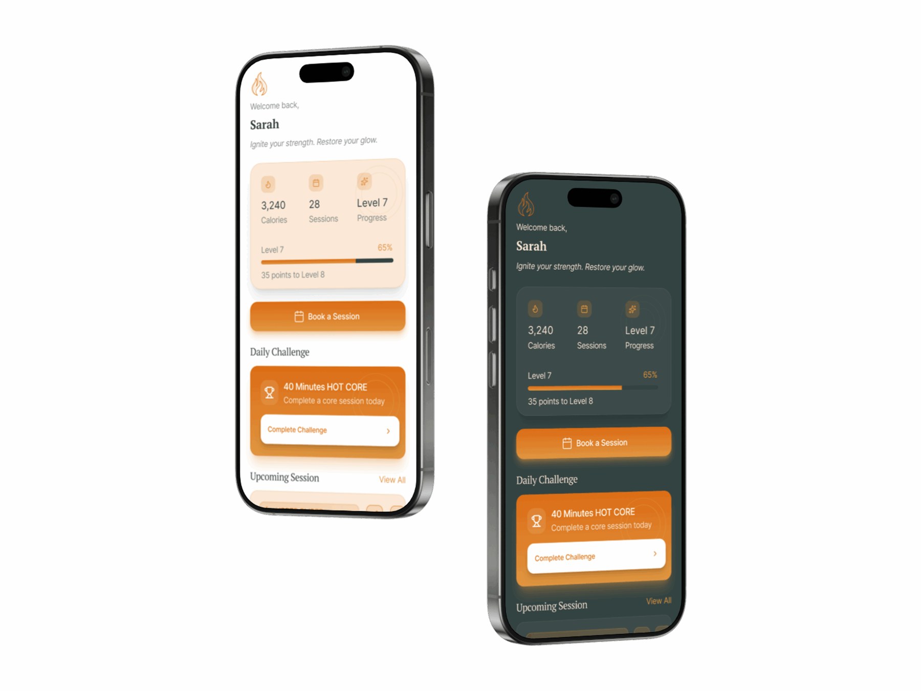
The wellness dashboard turns attendance into something a member can see. It tracks calories, sessions, levels and achievements, and pairs daily motivation with progress-based rewards.
It deliberately reflects holistic wellness rather than fitness metrics alone, which is what keeps it aligned with what Ember actually sells: balance through strength, sweat and stillness.